How I Increased Our Conversion Rate by 60% by Redesigning Our Navigation
With 90% of the world's population being right-handed, why is everyone placing the mobile menu in the top-left corner - the furthest away from the dominant right-hand thumb?
Lately, I've been thinking a lot about navigation. It's such an essential part of your online store, and yet very few people talk about it. While I’m sure your navigation doesn’t outright suck - I just couldn’t come up with anything better - I’m sure it's an area with a significant potential for improvement. And after doing a lot of research, I still think it is.
The problem
Let me ask you the question I kept asking myself. With 90% of the world's population being right-handed, why is almost everyone placing the mobile menu in the top-left corner - the furthest away from the dominant right-hand thumb?
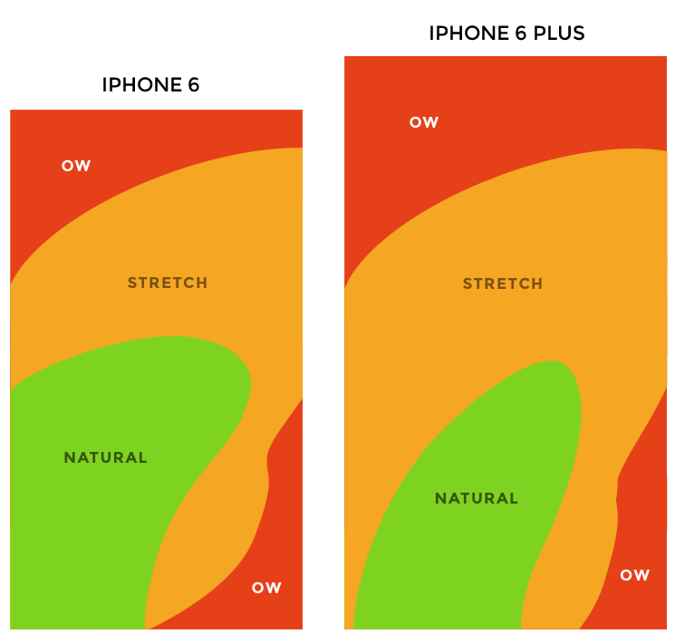
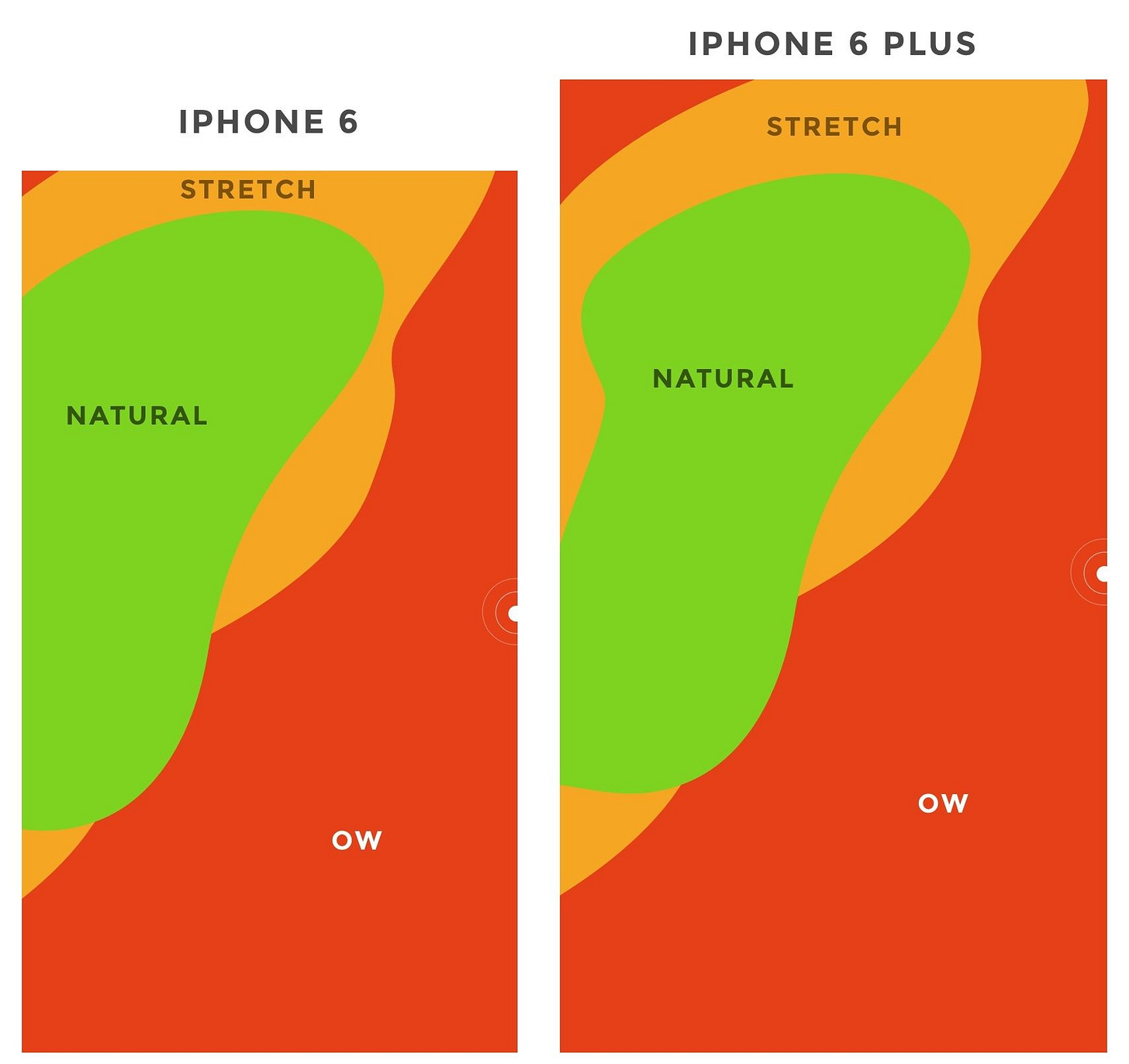
While they aren't entirely up to date, these Thumb Zone Heat maps by Scott Hurf accurately describe the problem. The heat maps illustrate which part of your screen you can easily reach with your thumb and which you can’t if you hold your phone anchored at the bottom right.
For a right-handed person, the menu is more or less unreachable. And if you mirror the image horizontally, representing a left-handed person, it's not much more accessible.
This isn’t much better if you hold your phone anchored in the middle of the phone. Try for yourself. You can reach the hamburger menu in the top-left, but it’s still doesn’t feel right.
The next question I asked myself was, "maybe more people than I think are using their phones two-handed?" But no. According to Steven Hoober, 75% of users touch the screen with only one thumb. Consequently, 75% of all your mobile visitors have to stretch their fingers unnaturally or change grip every time they want to access the menu.
In a world where everything is about friction, this seems wrong.
The Solution
Before telling you what I think is the best solution, remember to sign up for this newsletter to get more like this in the future. If you already subscribed - thanks a lot!
Alright, so what should we do instead? To figure that out, I researched what others before me have tested and concluded.
In 2013, Facebook went from a top-left hamburger menu to a bottom tab bar similar to what you'll see in the Facebook app now. According to TechCrunch, this increased engagement, satisfaction, revenue, speed, and perception of speed.
Tabbed menu bar 1 - 0 Hamburger Menu
In 2013, Zeebox (later Beamly) did the reverse and tested replacing a tab bar at the top of their app with slide-out navigation similar to what we typically see in eCommerce. The slide-out navigation decreased daily frequency (number of times in their app), weekly frequency, and time spent in-app. Zeebox quickly reverted to tabbed navigation at the top of their app.
Tabbed menu bar 2 - 0 Hamburger Menu
In 2015, Redbooth banished the classic hamburger menu and replaced it with a bottom tab bar in their iPhone app. The tab bar increased daily active users by 65% and the average session duration by 70%. When they analyzed the data, they saw that users discovered more of the functionality/content already available.
Tabbed menu bar 3 - 0 Hamburger Menu
Conclusion? I think the future of mobile eCommerce should consist of mobile navigation resembling the image below.
Put a menu bar at the bottom of your site, close to the thumbs, with a hamburger menu, search, and shortcuts to the 2-3 best-selling products or categories. If you think about it, this is what most Apps like Facebook, Twitter, Snapchat, etc. do.
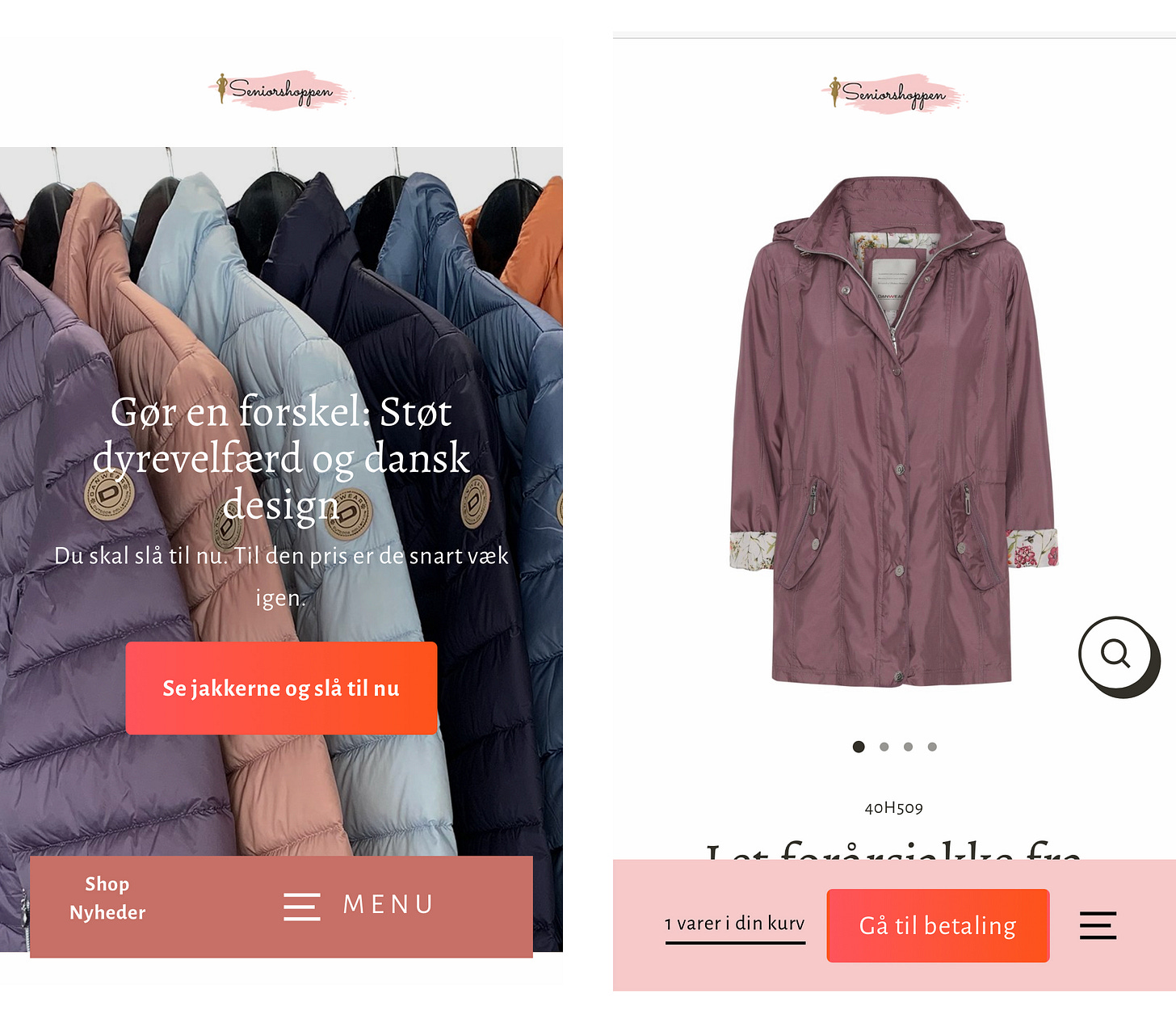
I recently implemented a similar navigation bar in two of our stores, but with fewer “tabs” and more focus on the checkout button when an item is added to the cart. The left image is the menu bar without any items in the cart. Here’s a shortcut to our new collection and a menu button. The right image is the menu bar after an item is added. From left to right: The cart, “Go to checkout”, and a hamburger menu.
So far, we’re seeing an increase in CR in both stores. Tabbed menu bar 4 - 0 Hamburger Menu. I’m going to test a “full tabbed version” with shortcuts to e.g. shirts and pants ASAP.
“But Amazon has a hamburger menu at the top left?” Yes. But if you open the menu, you’ll notice that the menu focuses on user account stuff. The product categories are located below the search bar at the top of the page similar to a tabbed menu bar. Opposite to most DTC brands, Amazon must focus on the search bar due to the large product catalog.
I urge you to test a tabbed menu bar out in an A/B test. If you do, please send me your results.
Please Subscribe and Share on Twitter
If you got value out of this and aren’t subscribed, remember to subscribe here to get more like this in the future:
If you’re already subscribed, I would really appreciate you sharing this article on Twitter. This tells me that you enjoyed the article and motivates me to do more like this.
Godspeed,
Mathias
PS: Please don't nest your product categories in a "Shop" dropdown. This especially sucks at mobile.
Reduce friction. Put your best-selling categories directly in your top-level main menu, and place the rest in an "Other"/"Info"/"Help" category at the end of the menu.


Definitely something to think about!
genius.